MeeOpp EdTech brand refresh
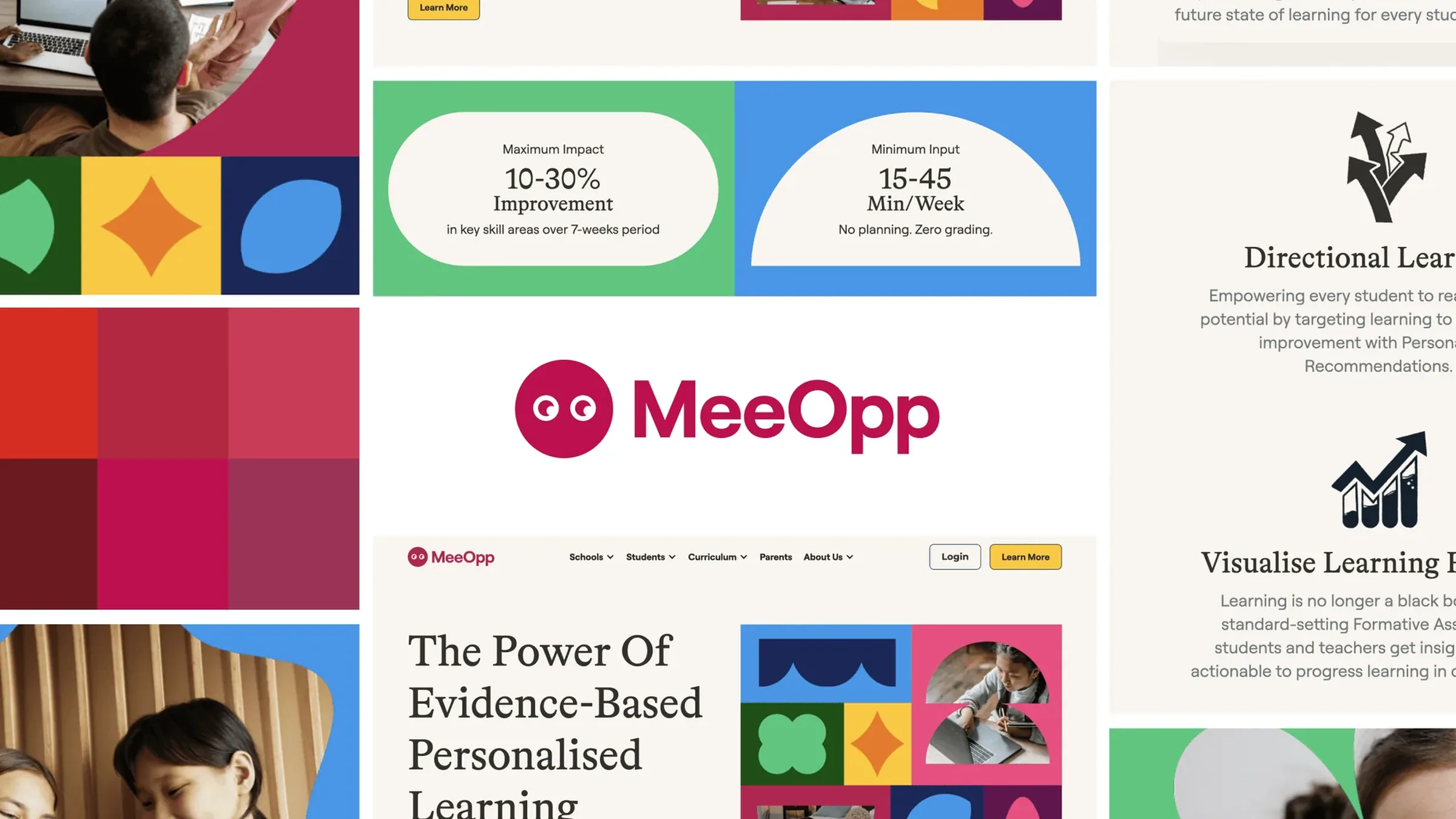
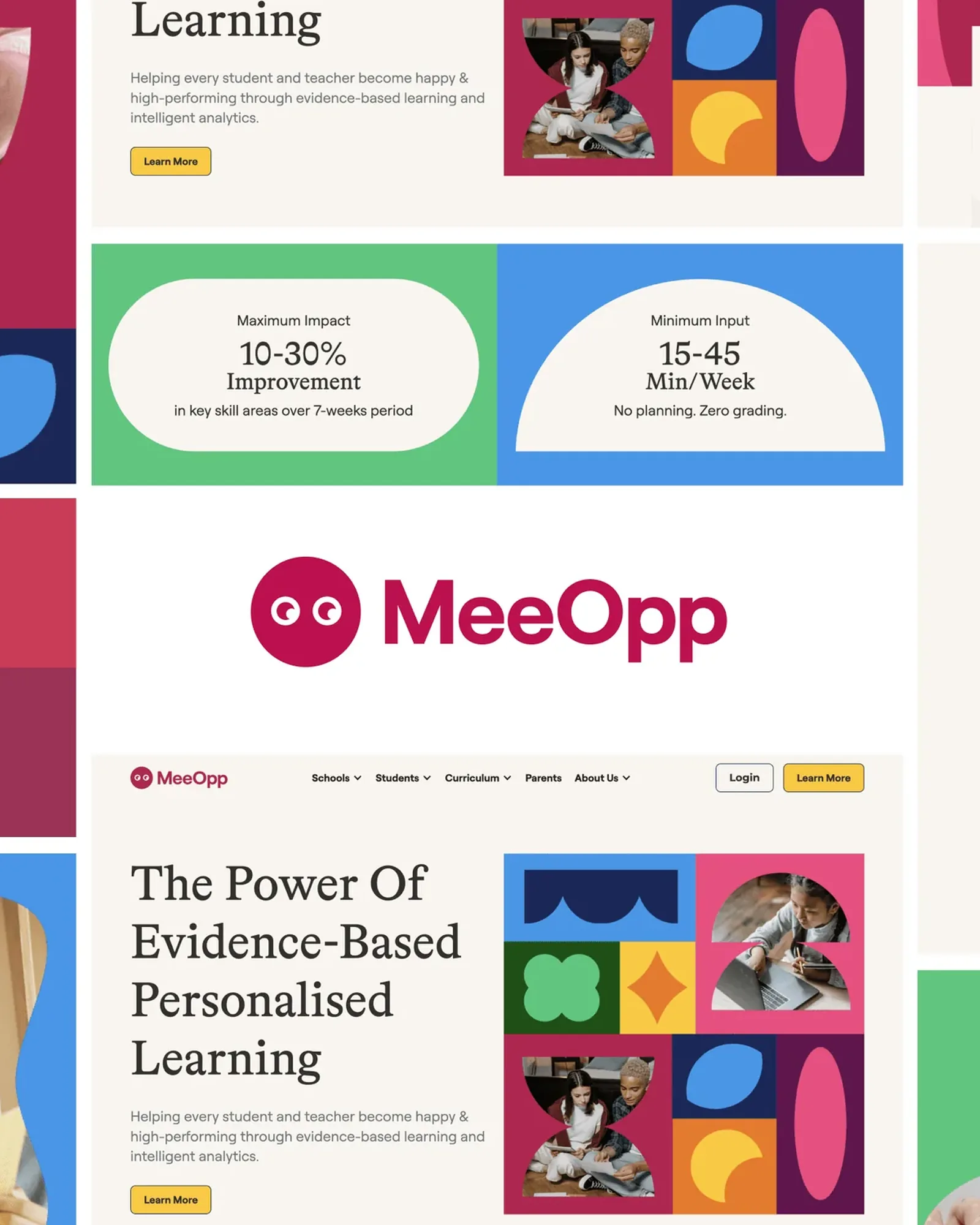
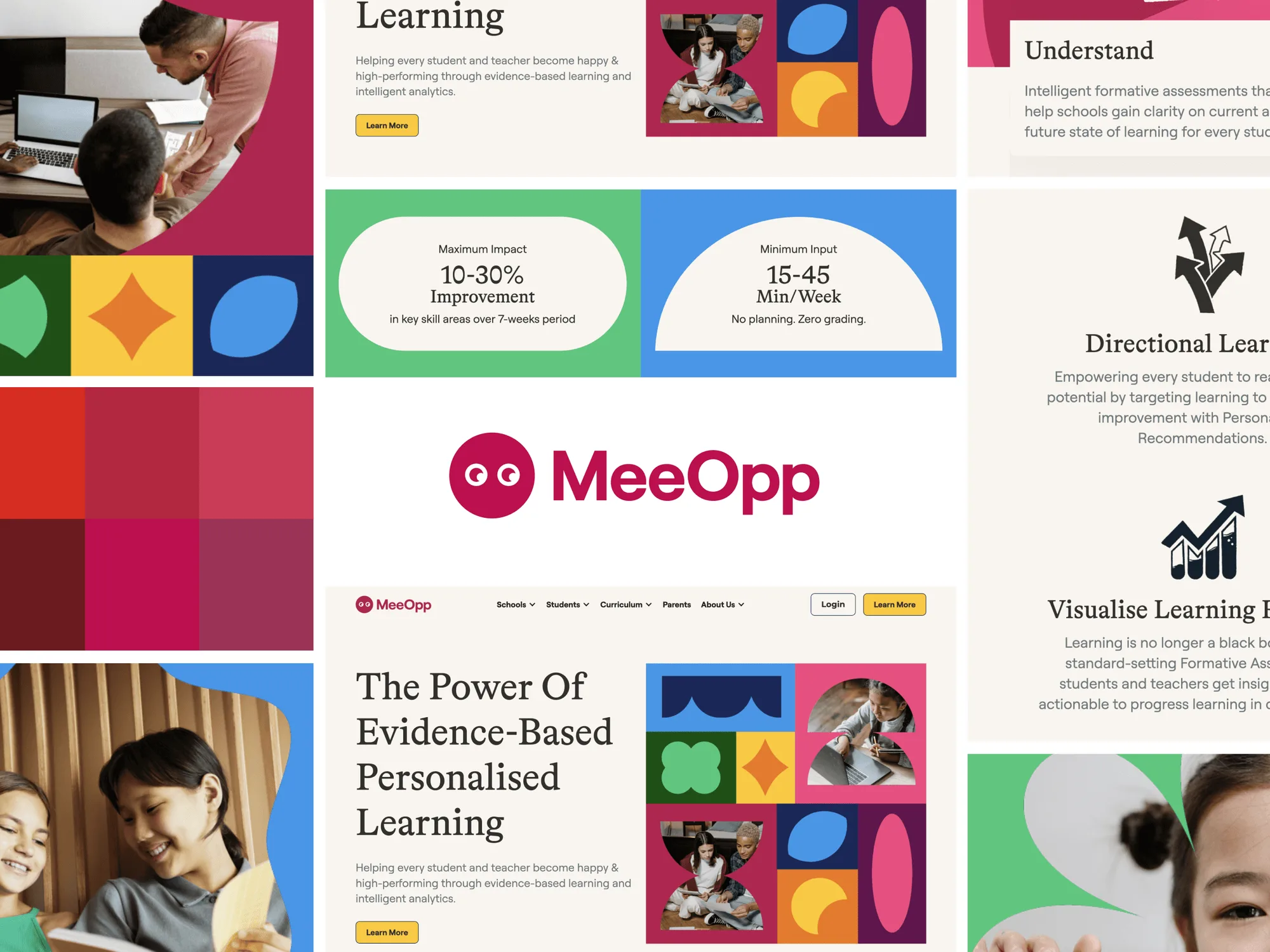
The MeeOpp brand refresh: the magenta wordmark with its eyes, a magenta palette, website sections on evidence-based personalised learning, and student photos
Role
Brand identity
Client
MeeOpp
Industry
Education technology
Year
2024

I refreshed the brand for MeeOpp, an EdTech company for personalised learning.

The refresh is a magenta wordmark with a pair of eyes, a family of bright geometric shapes and a robot mascot, carried into the app, merchandise, a presentation deck and the website.

Identity

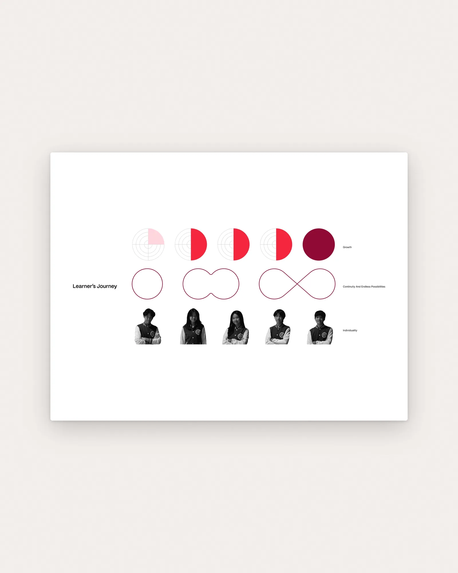
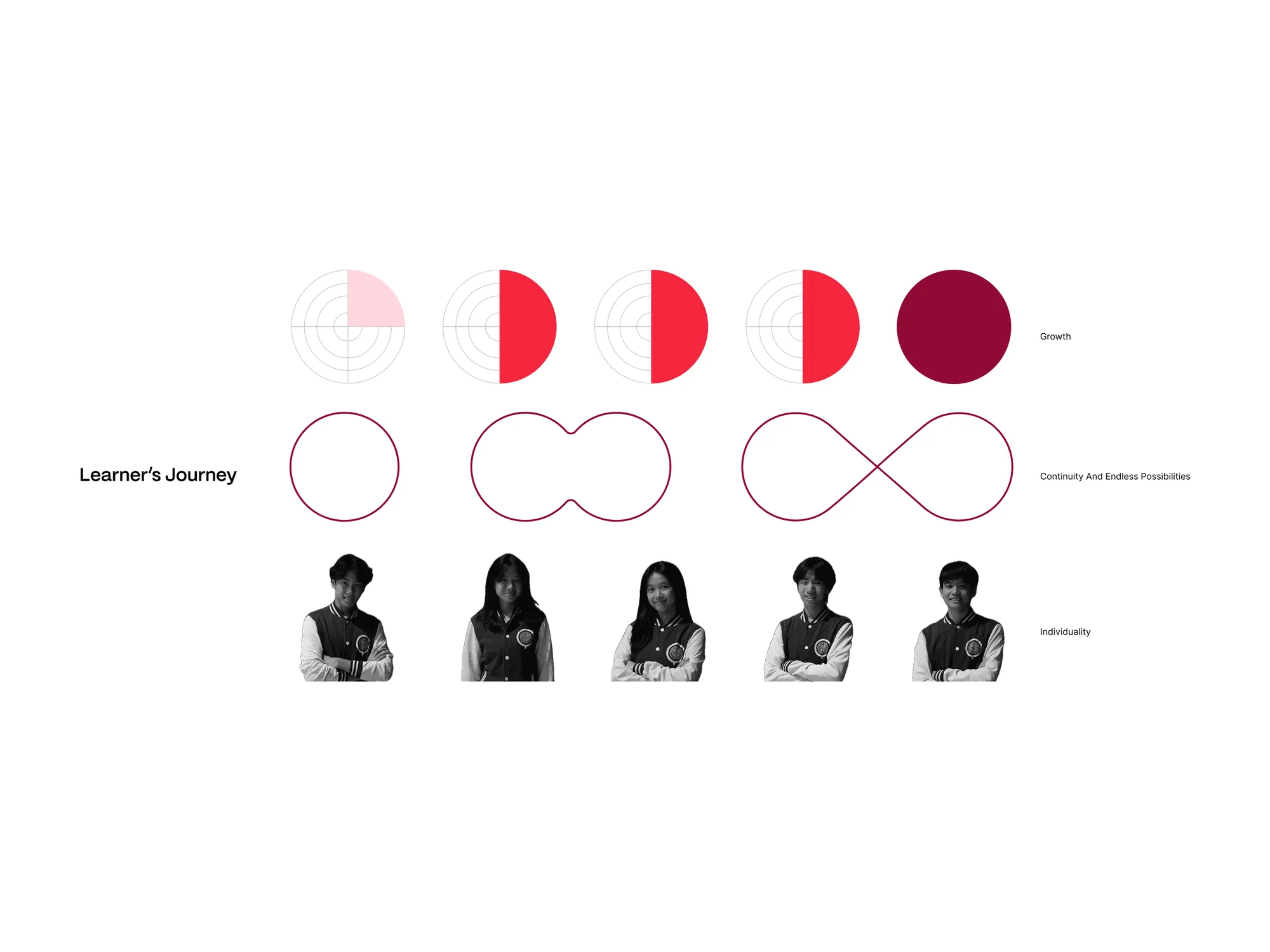
The shapes map a learner's journey: growth, continuity, individuality.
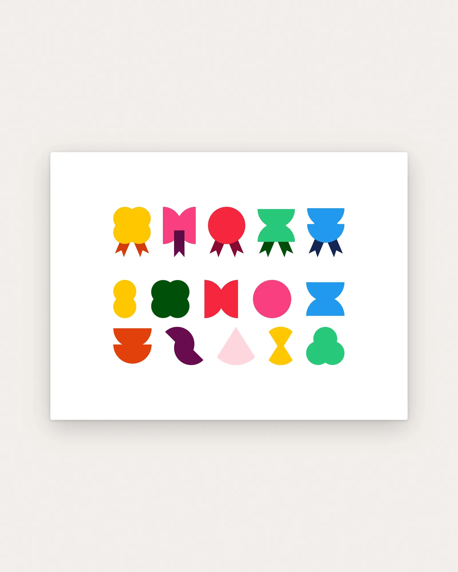
Fifteen flat MeeOpp shapes in yellow, pink, red, green, blue, orange and purple, some with ribbon tails like badges, on paper
The Learner's Journey diagram on paper: circles filling for Growth, a circle becoming ∞ for Continuity, and student portraits for Individuality

Applications

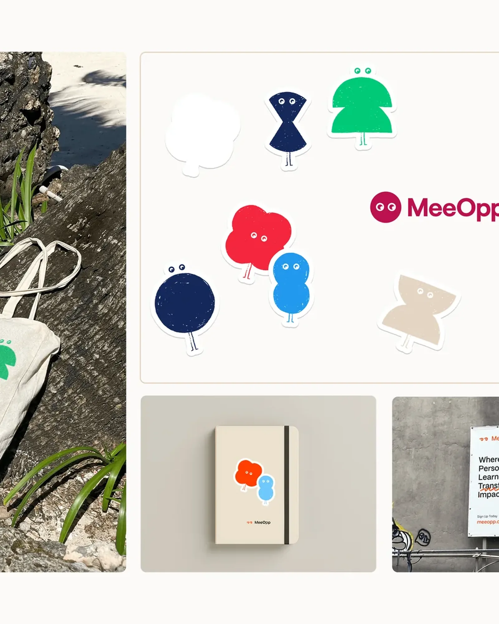
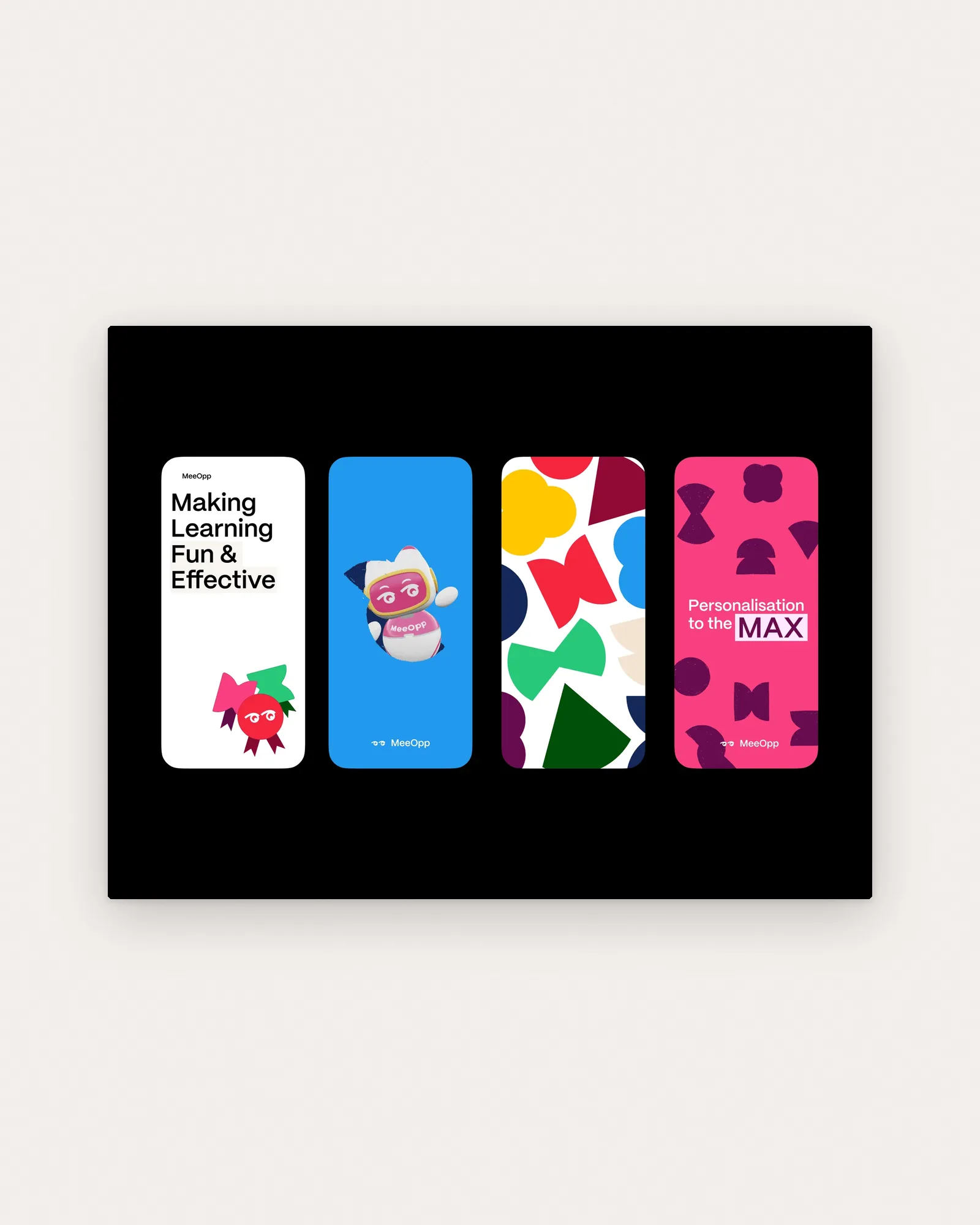
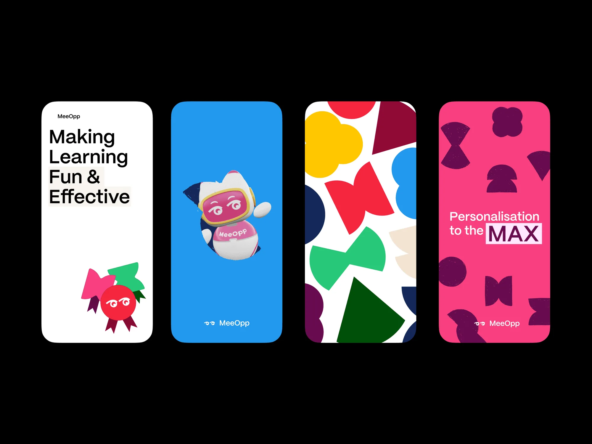
Making learning fun and effective, on screens, bags and billboards.
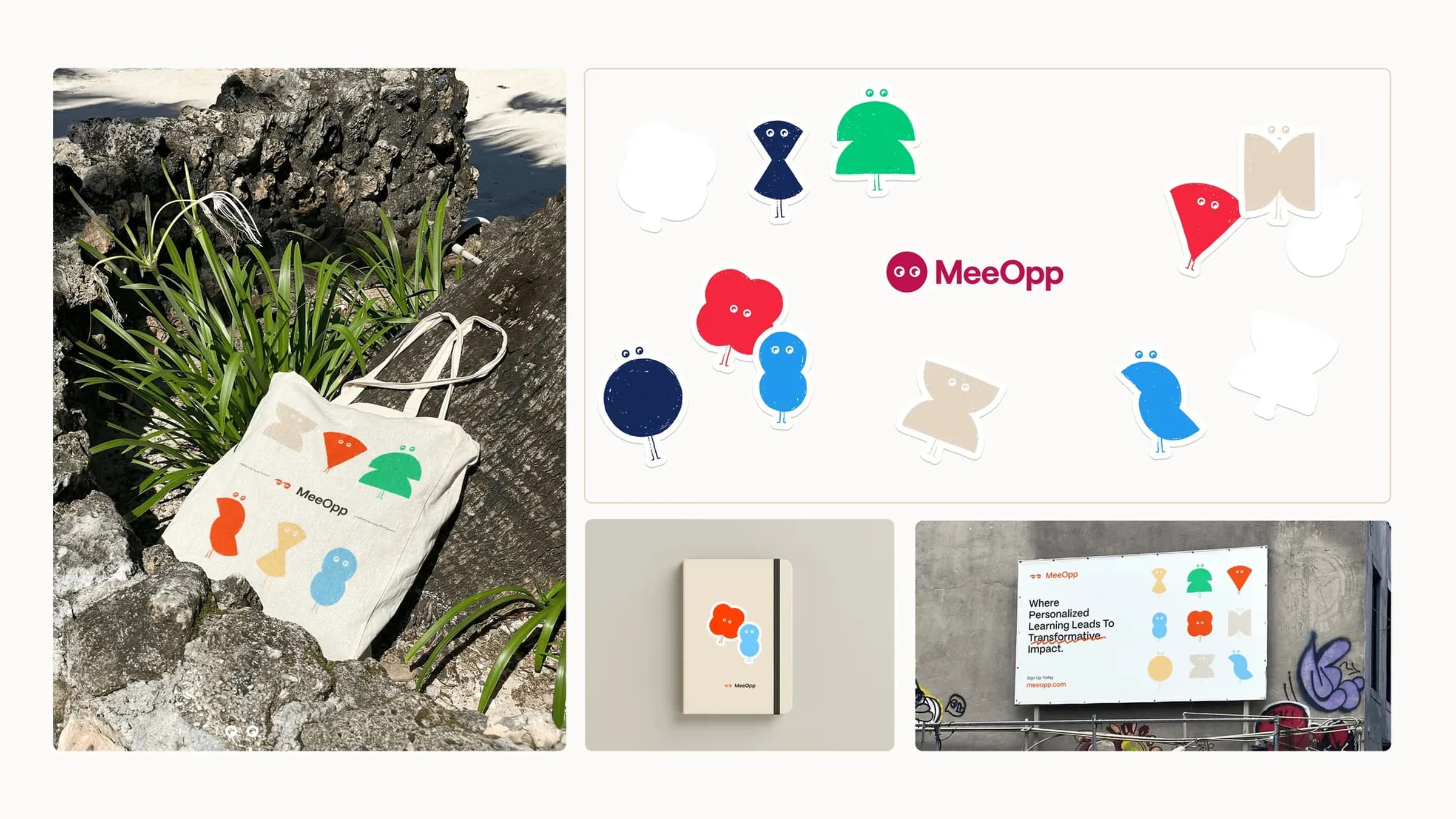
MeeOpp merchandise: a tote bag on rocks, shape-character stickers, a notebook and a billboard, Where Personalized Learning Leads To Transformative Impact
Four MeeOpp phone cards on black, on paper: Making Learning Fun & Effective, the robot mascot, a shape pattern and Personalisation to the MAX
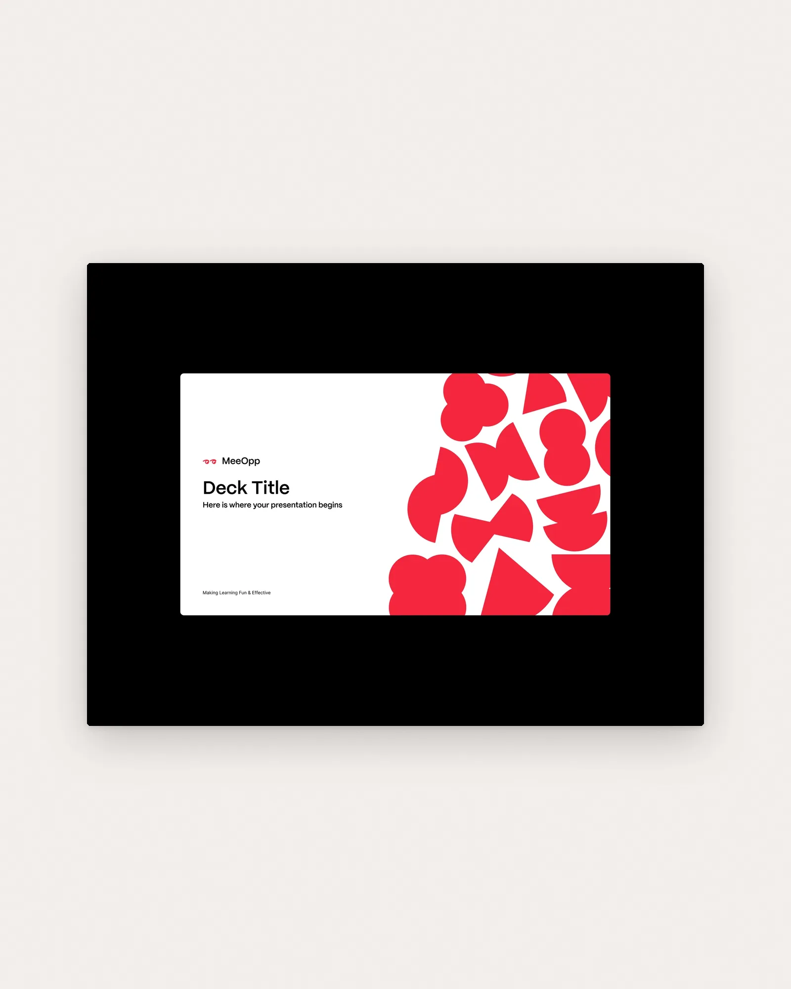
The MeeOpp presentation template's title slide, with the logo and a cluster of red shapes, on paper

Research and web

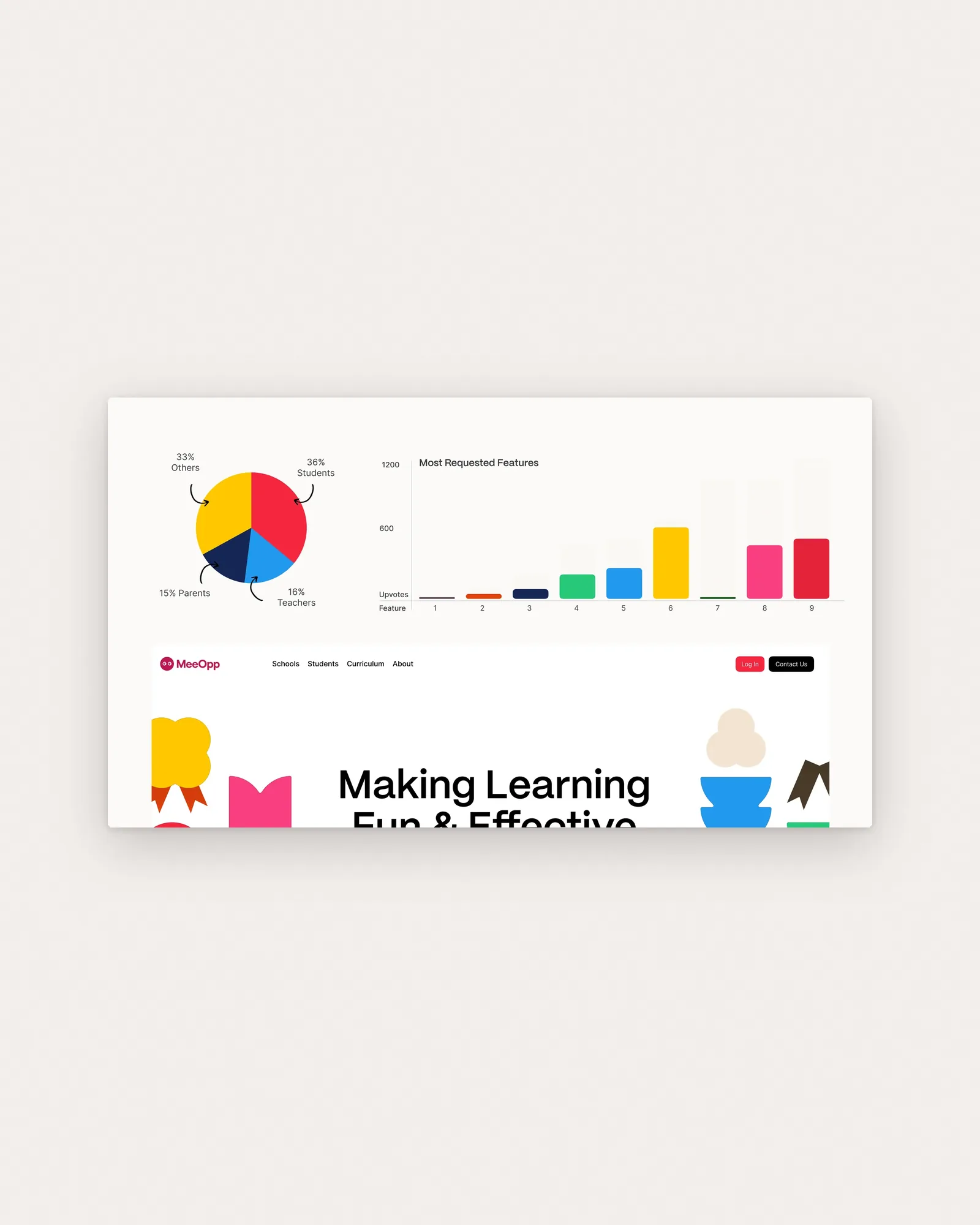
Research with students, teachers and parents shaped the website.
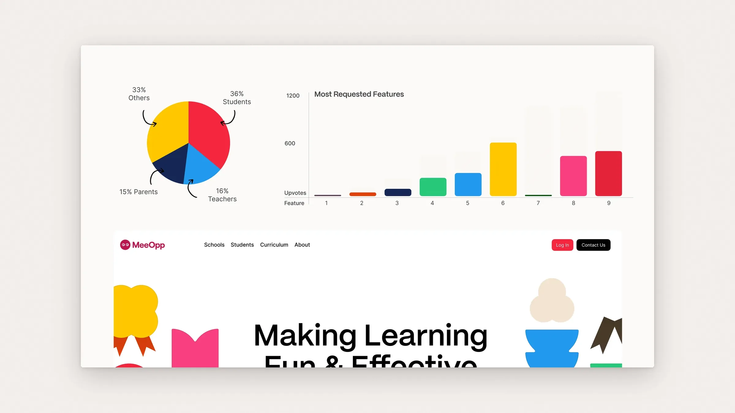
A pie chart of respondents (36% students, 16% teachers, 15% parents) and a Most Requested Features chart above the MeeOpp website hero, on paper

Connections