Phia
- Role
- Product & web design
- Surfaces
- Web, SEO pages, iOS
- Industry
- Shopping
- Stage
- Series A, $35.5M
Phia is a shopping product with 1.5M users and a $35.5M Series A. From late May to early August 2026 I designed the pages people land on from a Google search, before they install the app or the Chrome extension: brand pages, editorials and the partner page. I also designed the iOS app's notifications. Most of the work was one-on-one with the growth PM.
The brand page template went from 11K pages to more than 400K while I was there. The site gets around 400K organic visitors a month.
I built each design as a coded prototype at 1440 and 390 wide, and the team reviewed those instead of Figma frames.
Impact
11K to 400K+ brand pages from one template, ~400K organic visitors a month, landing on the pages from Google, about a week from the notifications PRD to a reviewed second version.
Brand pages and editorials
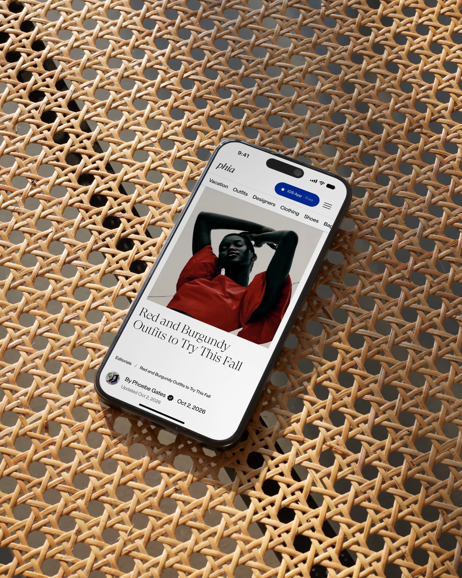
Each brand page introduces the brand first, then one coupon prompt, then its products.
The sandbox
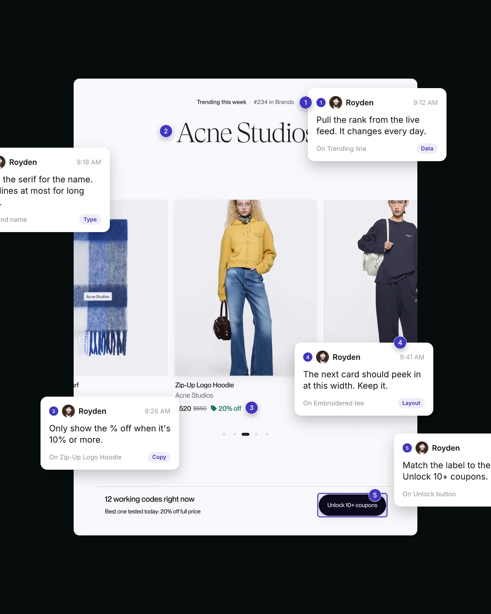
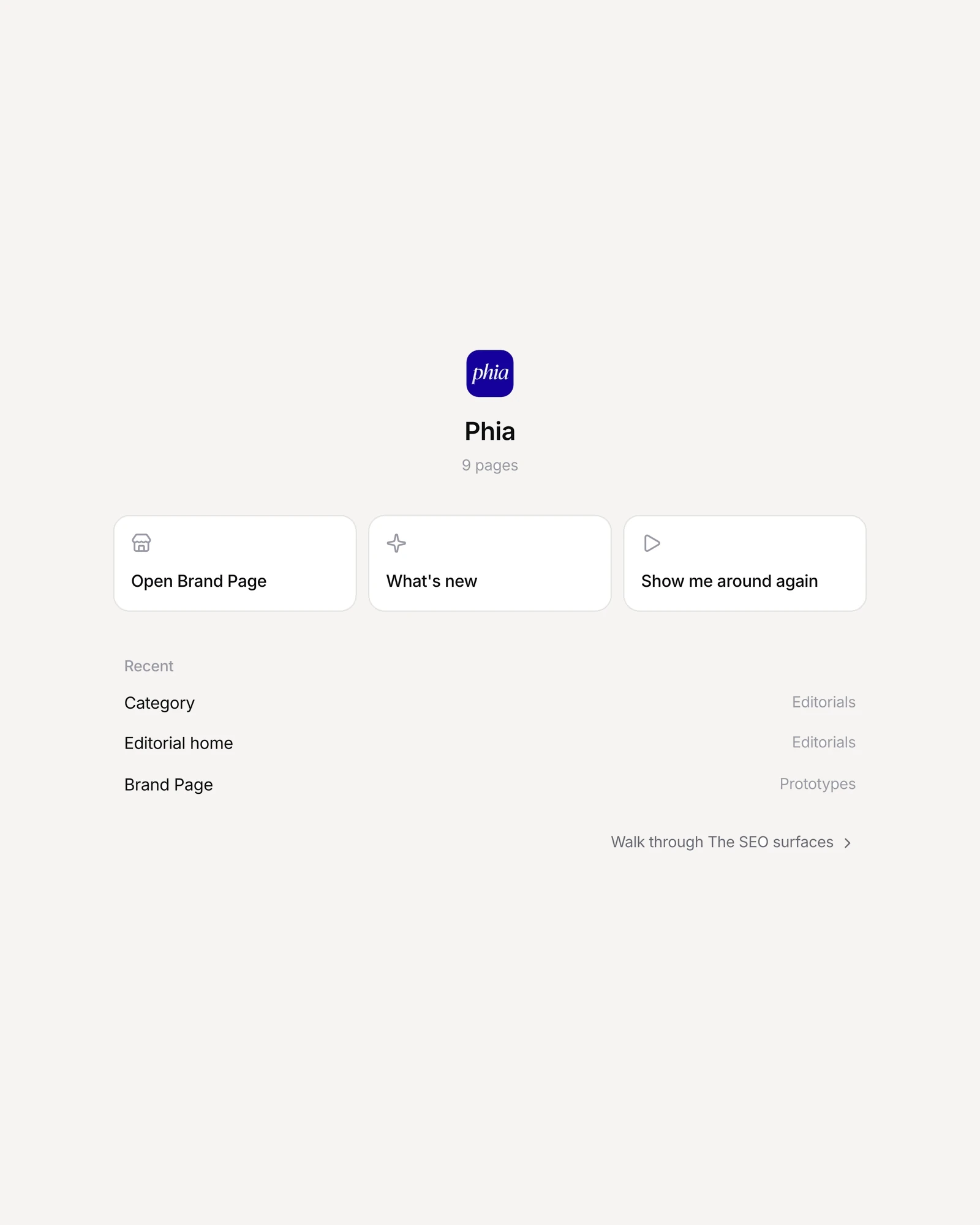
I built a Next.js preview app where the team reviewed working prototypes and pinned comments to them.
In-app browser and partner page
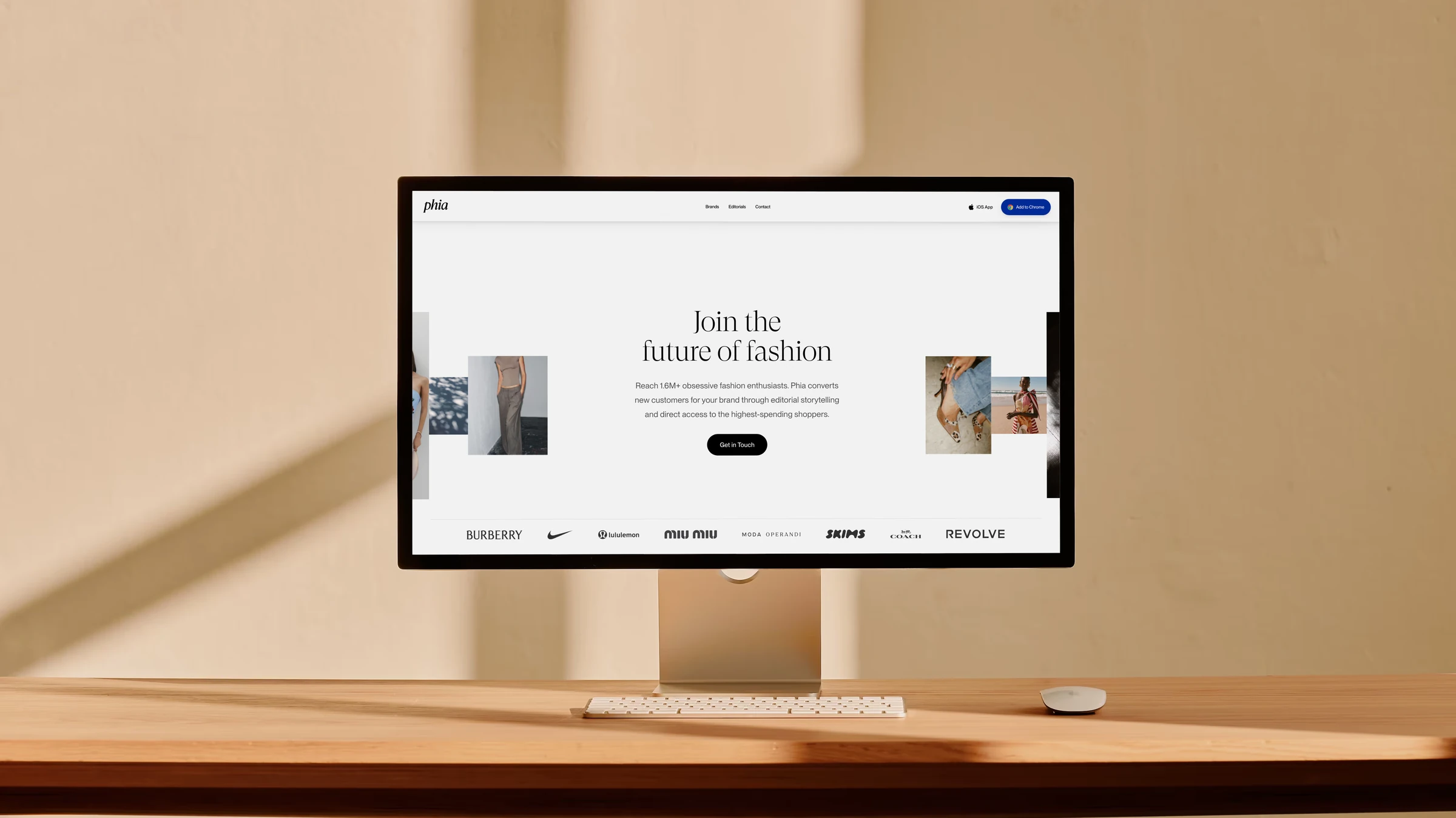
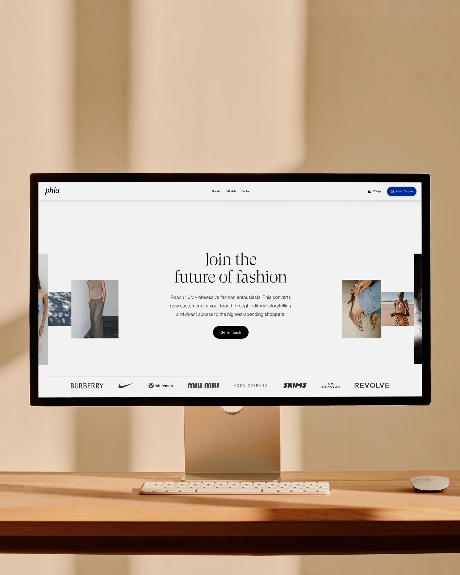
I tested five nudges inside Instagram's browser and built the partner page in code.
Notifications
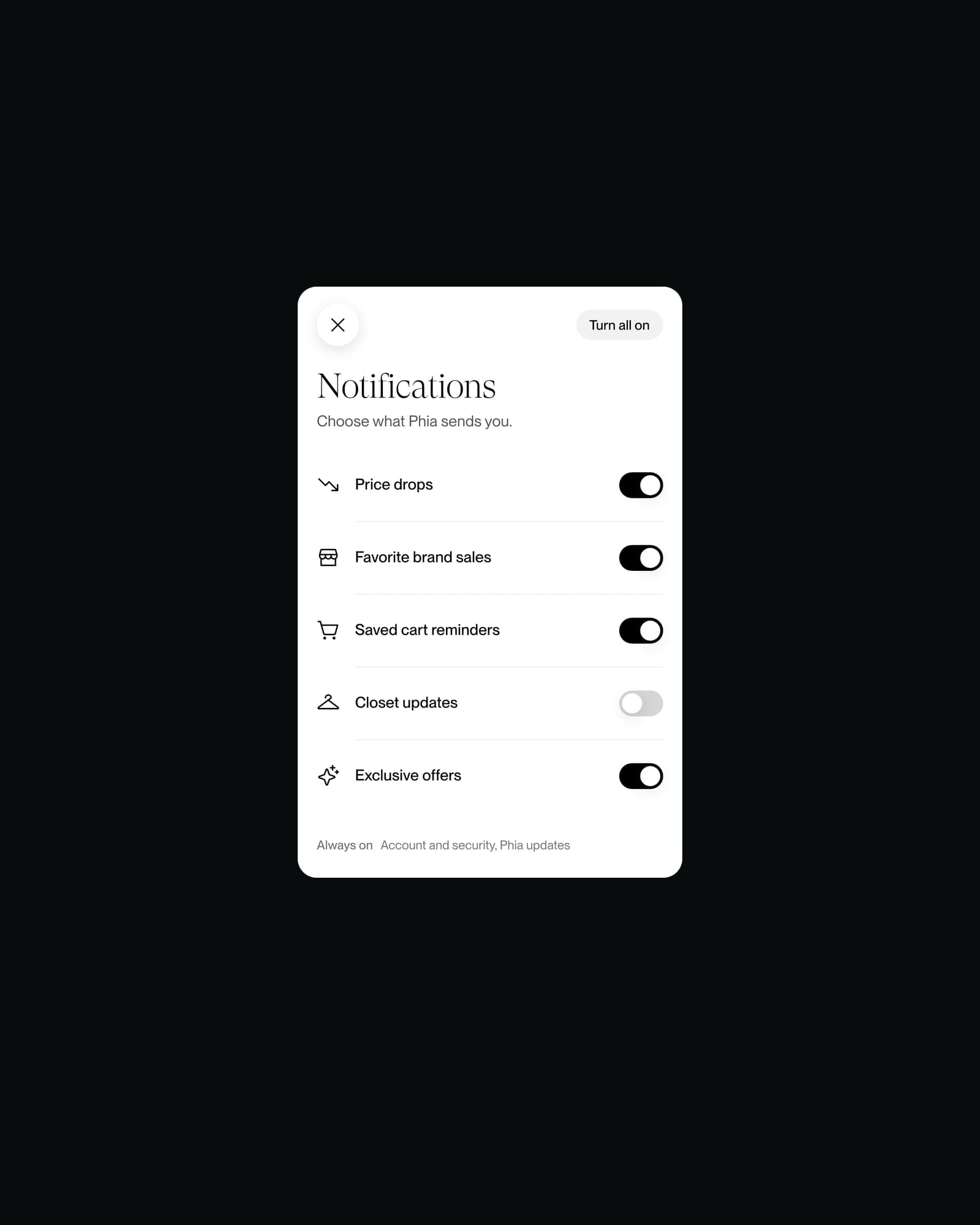
Each topic has its own off switch. The PRD asked for one switch for everything.
Featured
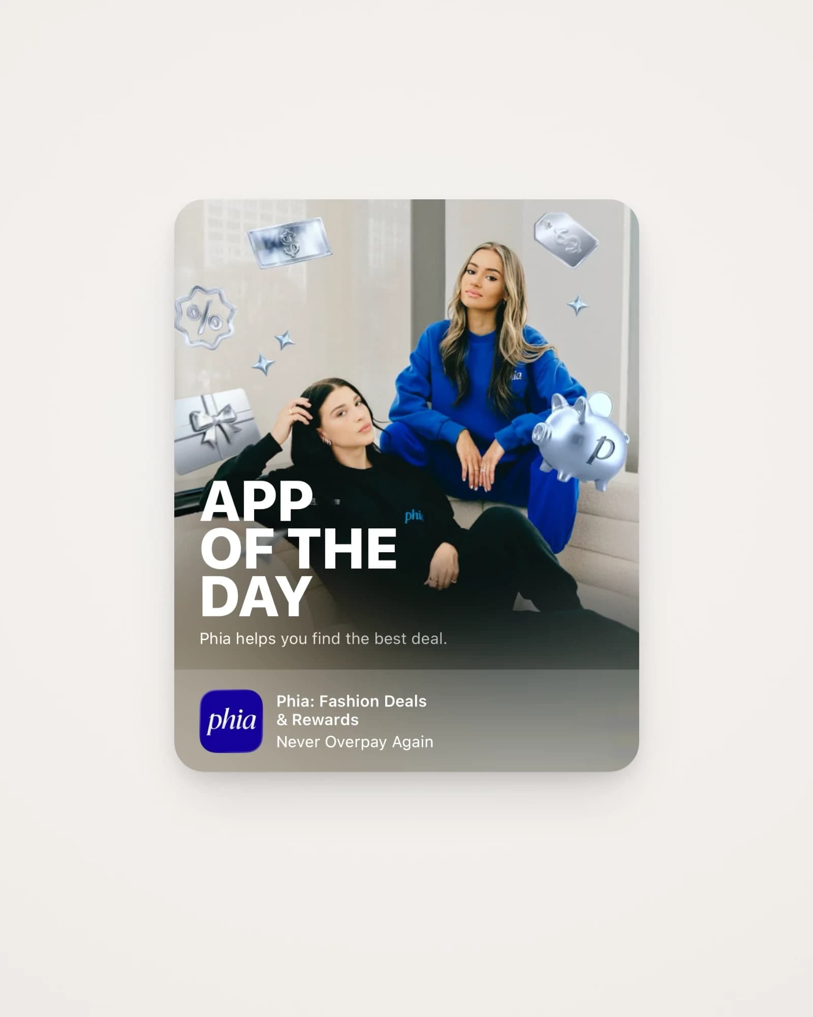
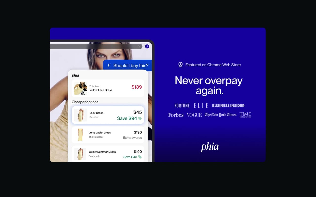
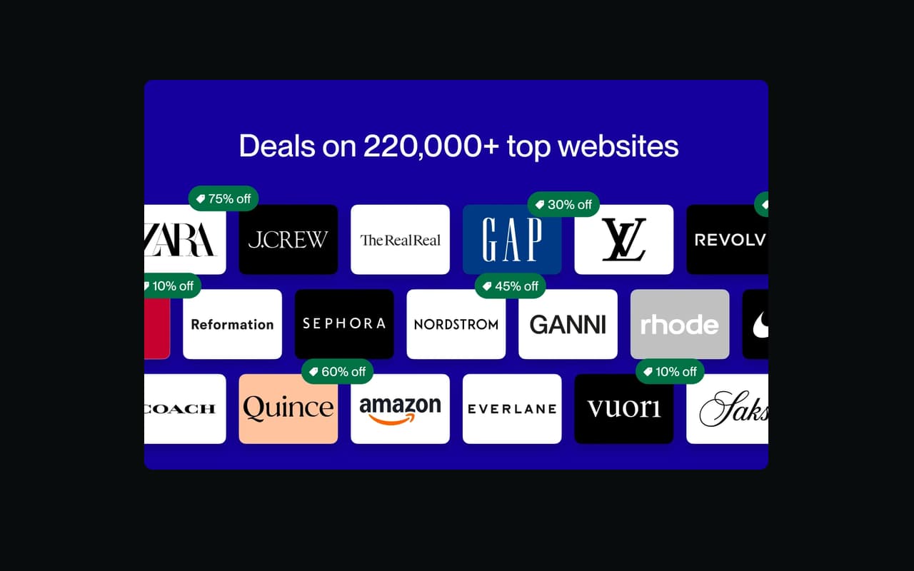
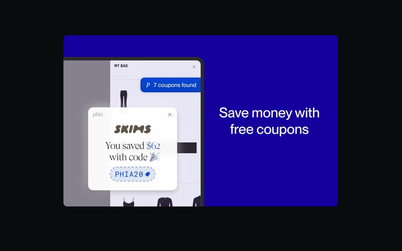
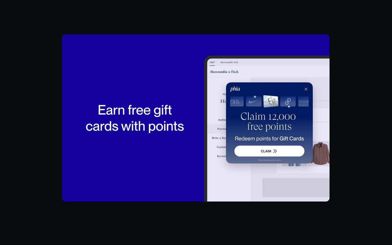
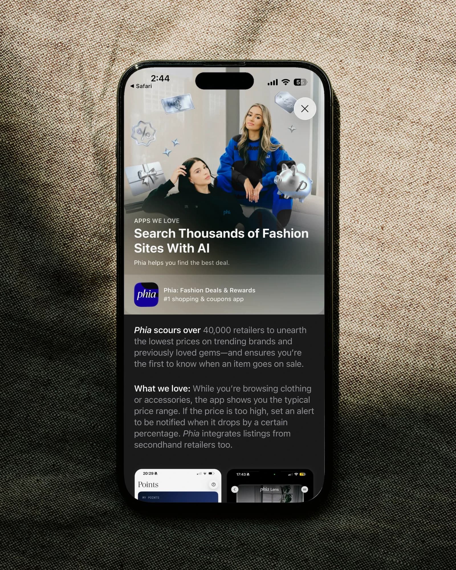
App of the Day and Apps We Love on the App Store, Featured on the Chrome Web Store.
Looking back
Most of what I cut from v1 was something the data couldn't support yet. A page system is a data problem first.
Connections
- Design Meetup x Phia
- Explorations
What I owned
Brand pages, including the luxury version and the states for brands with little data.
Editorial pages (home, index, category and article) and the block kit behind them.
The iOS notification feed and settings.
The in-app browser tests and the recommendation that came out of them.
The partner page, designed and built.
The sandbox, where every prototype was reviewed.
Images for the Chrome Web Store and the App Store.
What I contributed
A rework of the marketing landing page: a grey hero, blue only on buttons, "How it works" moved up, and real photography.
A design pass on the sales calendar, and a week running its development while the PM was away.
Design input on search, web chat, the creator program and a points campaign.
Build reviews with engineering on the SEO pages, and a simpler QA setup: one doc and ticket for bulk fixes, separate tickets for one-offs.
The start of a design system: tidying components that had drifted and beginning an illustration library.
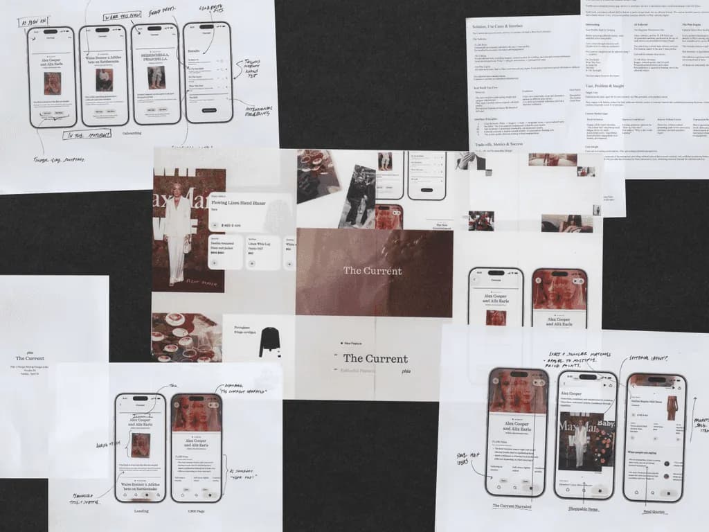
The Current, which won Phia's 48-hour Design-a-thon and has its own case study here.
What I learned
Build the alternative instead of describing it. An option people can tap settles the argument quickly.
Keep the reasoning next to the screen, or someone who missed the meeting will propose the same idea again.
A PRD is a starting point. I departed from it twice, both times where it worked against its own goal.
PRD to launch
PRD review: Weekly, on mockups, to agree scope before full designs.
Design review: One-on-one with the growth PM in Figma, until we picked a direction.
Prototype: I built that direction in code at desktop and phone sizes, with the real interactions.
Team review: The team reviewed the build, and each decision was noted next to its screen.
Build review: After the engineering kickoff, we reviewed their build until it matched the design.
Phased launch: We launched in stages, starting with what the data could support.
Brand pages and editorials, Problem
Someone searching for a brand lands on its brand page. If it pushes coupons before saying who the brand is, it looks like an affiliate site and people leave.
Editorials needed to bring in search traffic, keep shoppers reading, and carry placements the partnerships team could sell.
Brand pages and editorials, Decision
The page opens with one short coupon prompt, products right below, and the SEO copy as plain text instead of an accordion.
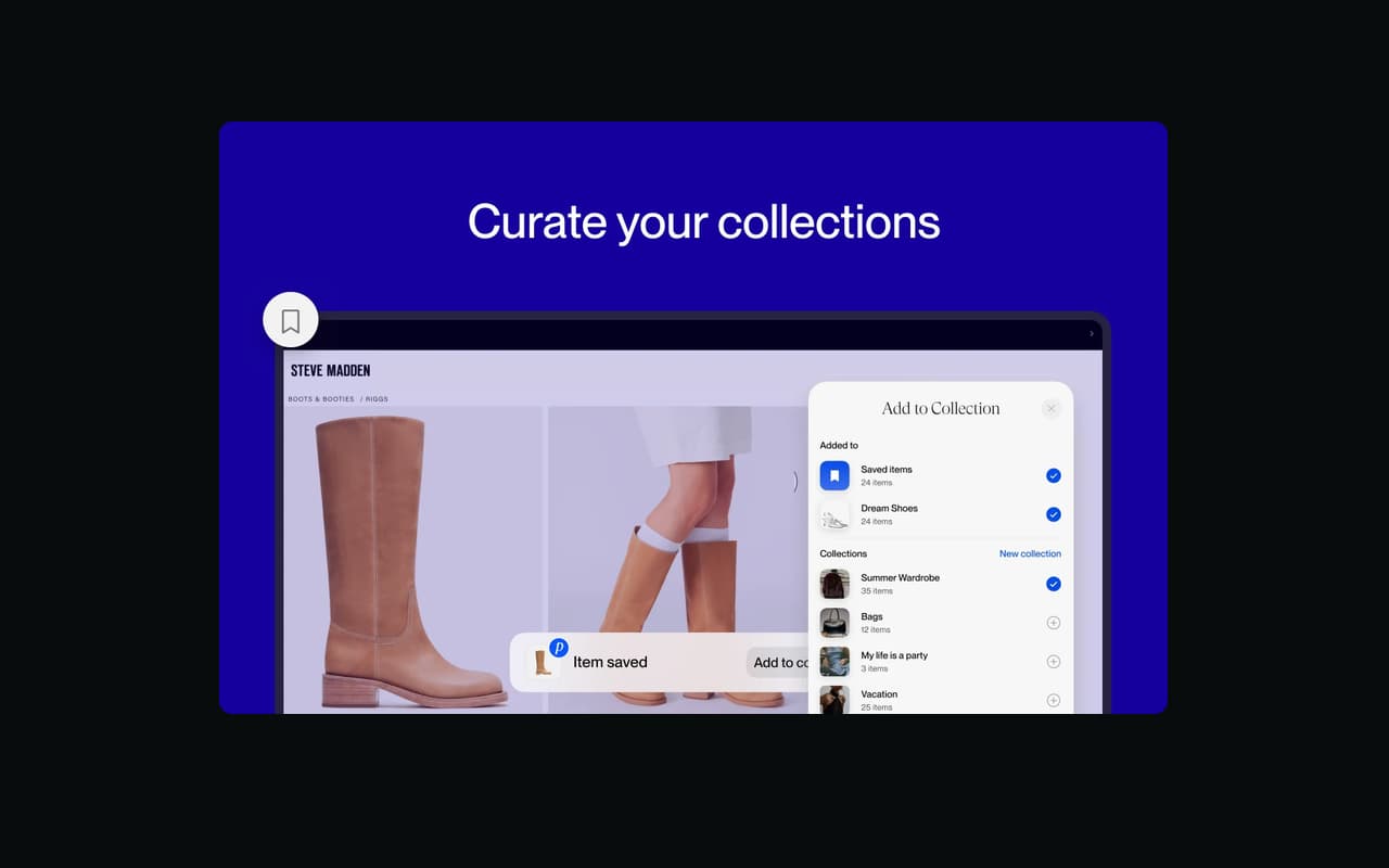
Codes stay blurred until you tap one, which opens a single unlock modal: add the Chrome extension, or scan a QR code for the app. A Phia-exclusive code gets its own card.
Most brands are missing something, so I designed states for no codes, few products or no editorials. Luxury brands use the same template with the coupons off.
Partnerships builds editorials in a block-based dashboard, so I gave them a kit of blocks. Home, index, category and article pages all come from it and one data file.
The index follows how placements are sold: a hero card, a row of medium cards, then compact cards kept for SEO.
Long-form articles alternate text and products, so the products read as part of the story. The product grid inserts itself every eight items.
Brand pages and editorials, Results
The first brand template shipped with a three-part SEO copy block. Brand descriptions are generated and can be edited in the admin.
Editorials came to four page types and three article templates from one kit. The old pages stayed live to keep earning traffic until the new design replaced them.
I built both in code at 1440 and 390, with the real fonts and the working coupon reveal.
Brand pages and editorials, Tradeoffs
We cut three things in PRD review. Shop Similar needed brand-to-brand data we didn't have yet, and return policies and seasonal sales wait until the data is reliable.
For editorials I left out what the backend couldn't support yet, like tags and the oversized lead image. I still designed them so everyone could see the direction.
The sandbox, Problem
The SEO pages had to match Figma exactly, and checking builds against static frames was slow. I sat down with the PM doing QA to find what would help.
The sandbox, Decision
I built a small Next.js app for the coded prototypes, with device frames, comments pinned to the screen, a notes panel, and a spec list comparing design with build.
The sandbox, Results
Reviews happened on the real interactions, like the unread highlight, swipe to delete and the coupon reveal. The reasoning stayed with each screen.
The sandbox, Tradeoffs
A build takes longer than a frame, so early ideas still started in Figma and only the chosen direction got built.
In-app browser and partner page, Problem
Editorials get opened inside the browsers built into Instagram and TikTok. The brief was to get readers into a real browser.
The partner page sat below the main navigation and split attention between a sign-in and a long free-text form.
In-app browser and partner page, Decision
I built five layouts and four versions of the copy on a real editorial inside a replica in-app browser, with the host app switchable live.
Layout decides how much the nudge interrupts, and copy decides whether people act. Changing one at a time showed which was doing the work.
I moved the partner page into the main navigation, with one Get in touch button that scrolls to a short form.
I built it in plain HTML, CSS and JavaScript with help from AI, so engineering received a working page instead of a Figma file.
In-app browser and partner page, Results
I recommended the top strip. Inside an iOS in-app browser, a link into the Phia app opens, but a link out to Safari doesn't.
The partner page went to production as I built it, and engineering only had to connect it. The team used the same approach on later projects.
In-app browser and partner page, Tradeoffs
The Open in browser button can't open Safari from inside the app. It copies the link and shows how, so the reader takes the last step.
With one button, the dashboard sign-in lost its place on the partner page.
Notifications, Problem
The app needed a notification feed and settings, built from a PRD, quickly.
Decisions that lose in review tend to come back later, so I wanted every option we turned down kept where people could still try it.
Notifications, Decision
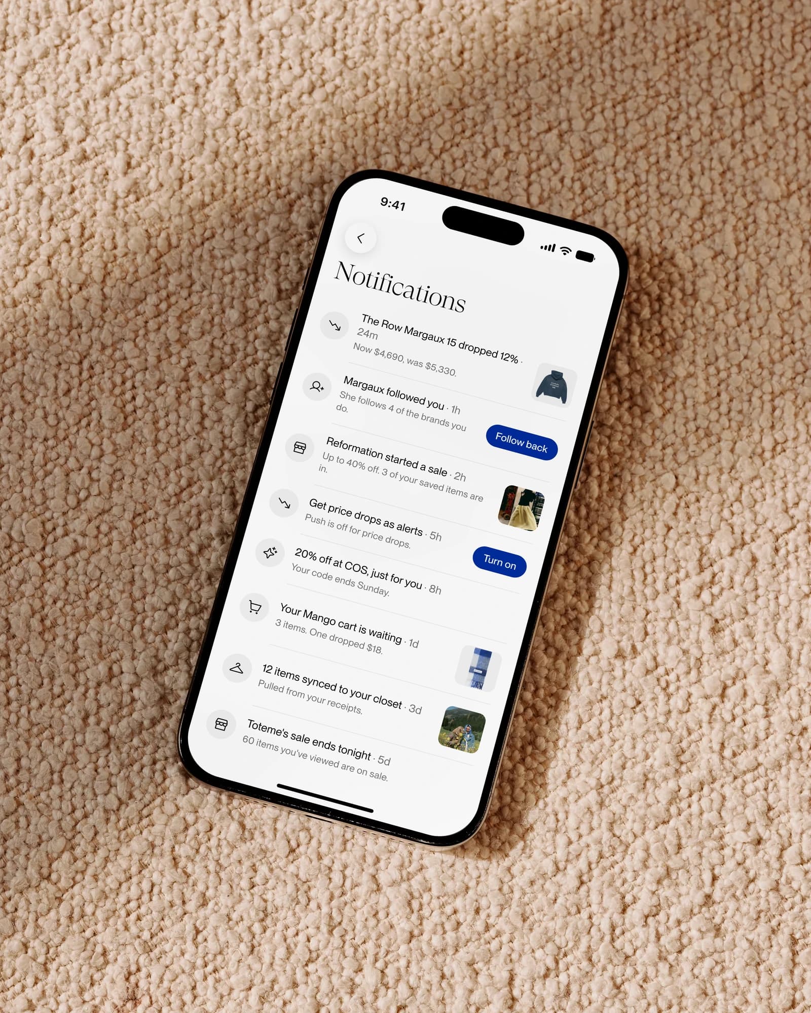
The feed became a full page and settings stayed a sheet. A backlog needs the whole screen, and a preference doesn't.
I dropped the day headings and the blue unread dot. Unread rows get a grey highlight that clears after about a second.
A row holds an image or a button, never both, and only gets a button when the action finishes right there.
Notifications are kept for 30 days, so the empty state got a proper call to action.
I argued against the PRD's single switch for all push notifications. One careless tap would turn everything off, so each topic turns off on its own.
Notifications, Results
It went from PRD to a reviewed second version in about a week, with every screen tappable.
The six decisions overturned in review can still be tried in an archived tab, each with the case for and against.
Notifications, Tradeoffs
There's no undo, so swipe to delete only commits at 190px, well past the 88px that reveals the button.
Anyone who wants everything off has to turn off each topic.