Shazoom F1 in Schools identity


- Role
- Brand identity
- Client
- Shazoom, F1 in Schools team
- Location
- Hong Kong
- Year
- 2024
I designed the brand identity for Shazoom, an F1 in Schools team from Hong Kong.
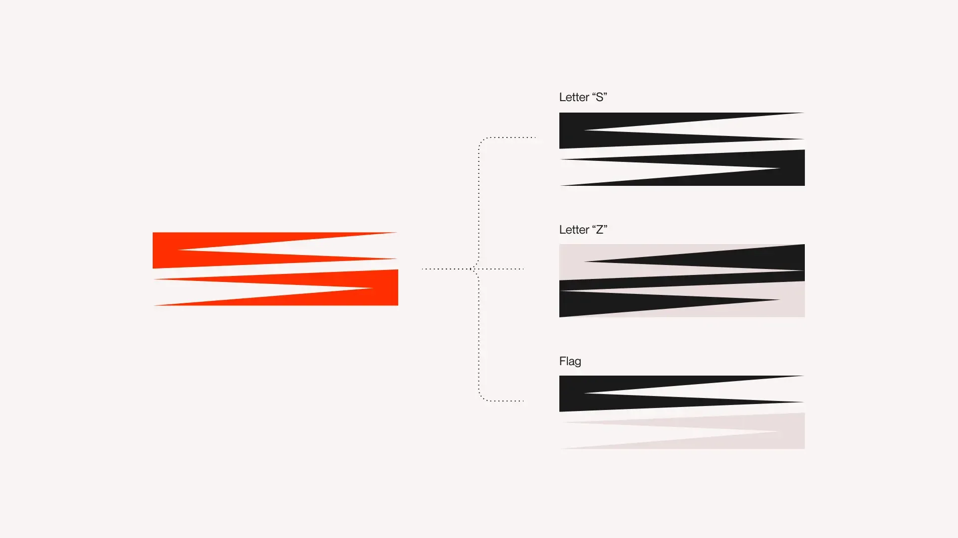
The mark is a stack of red wedges that reads as an S, a Z and a flag at once. It sits beside a wide wordmark, and runs through the guidelines, the team's cards and its digital presence.
The mark
One red mark reads as an S, a Z and a flag.


Guidelines
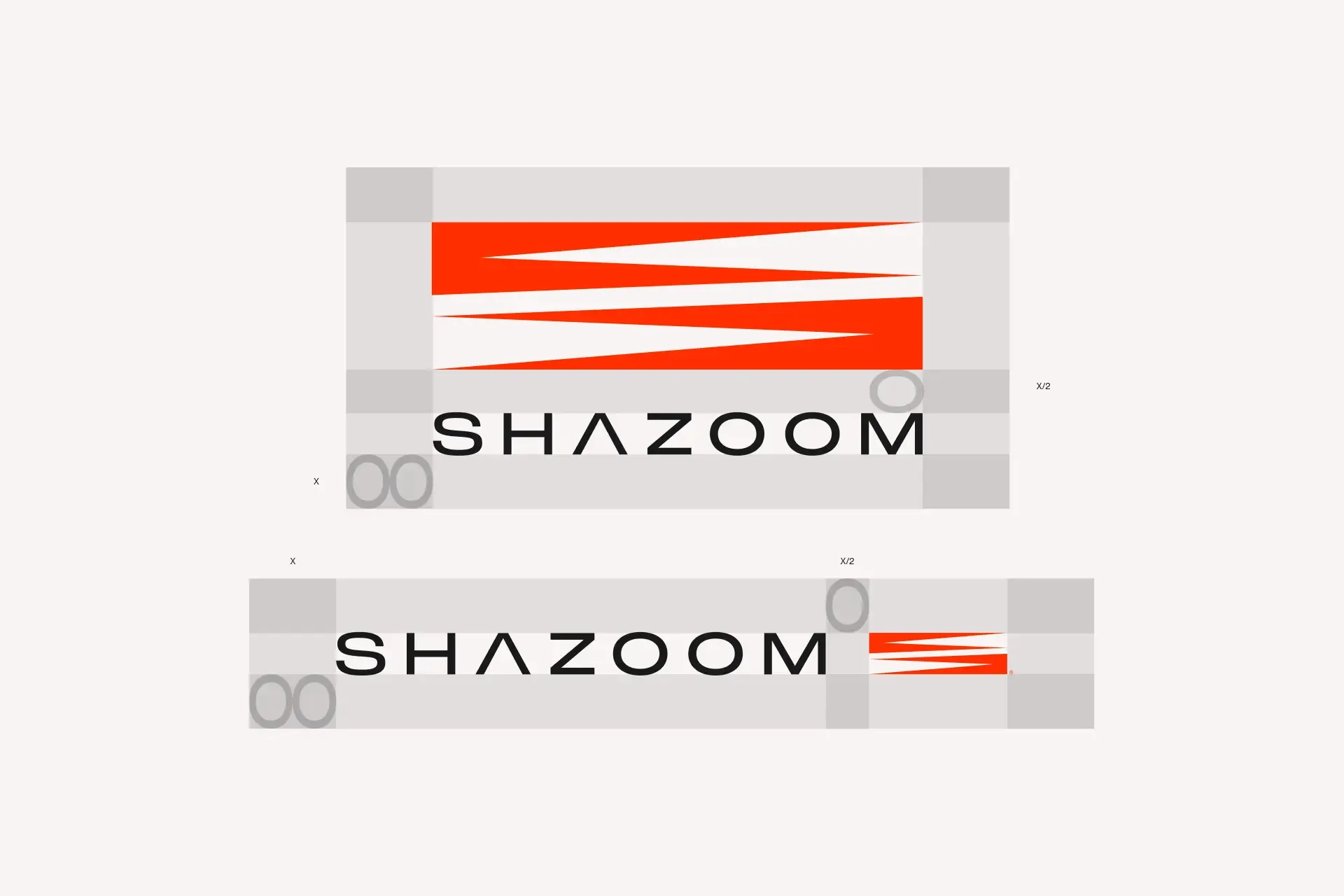
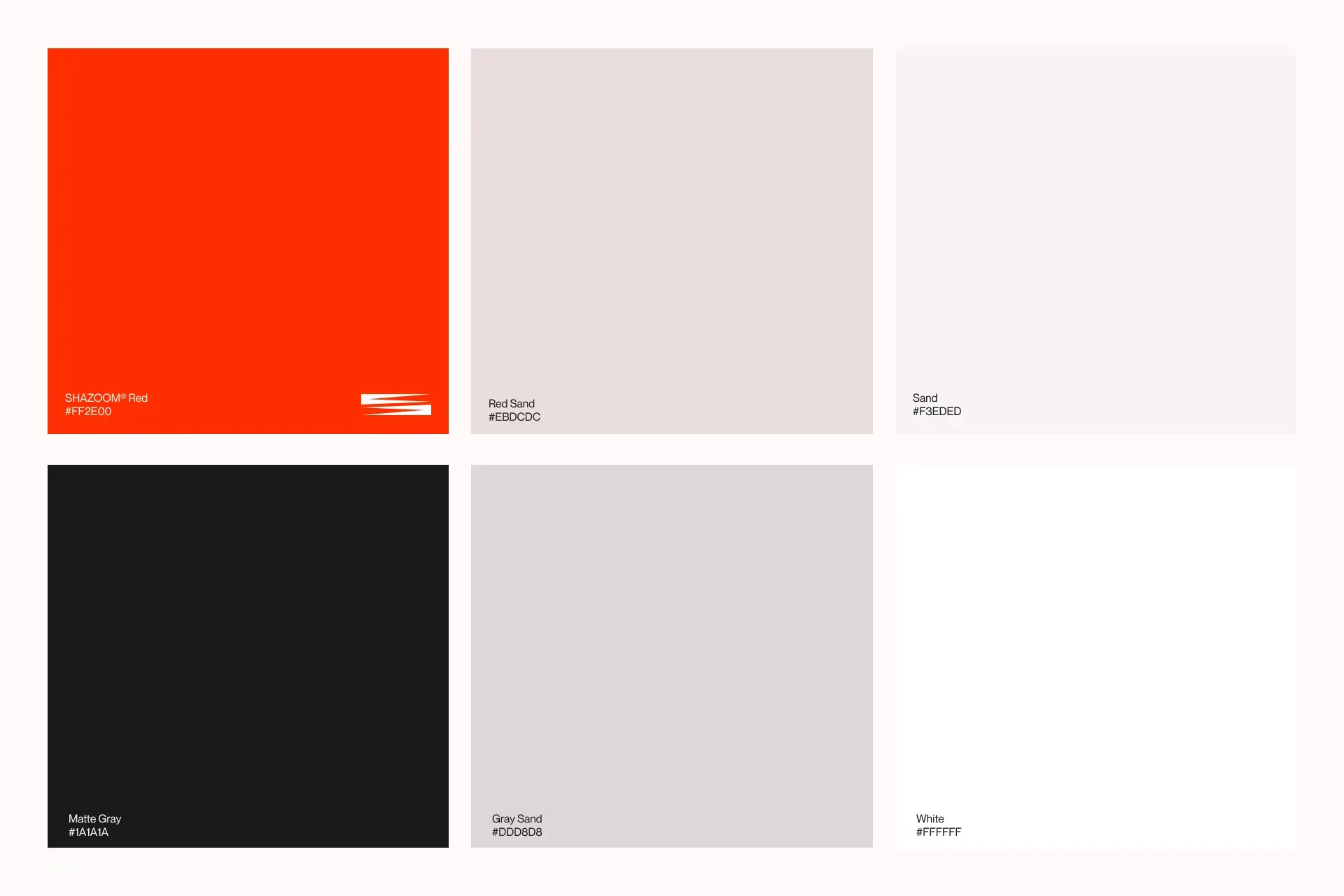
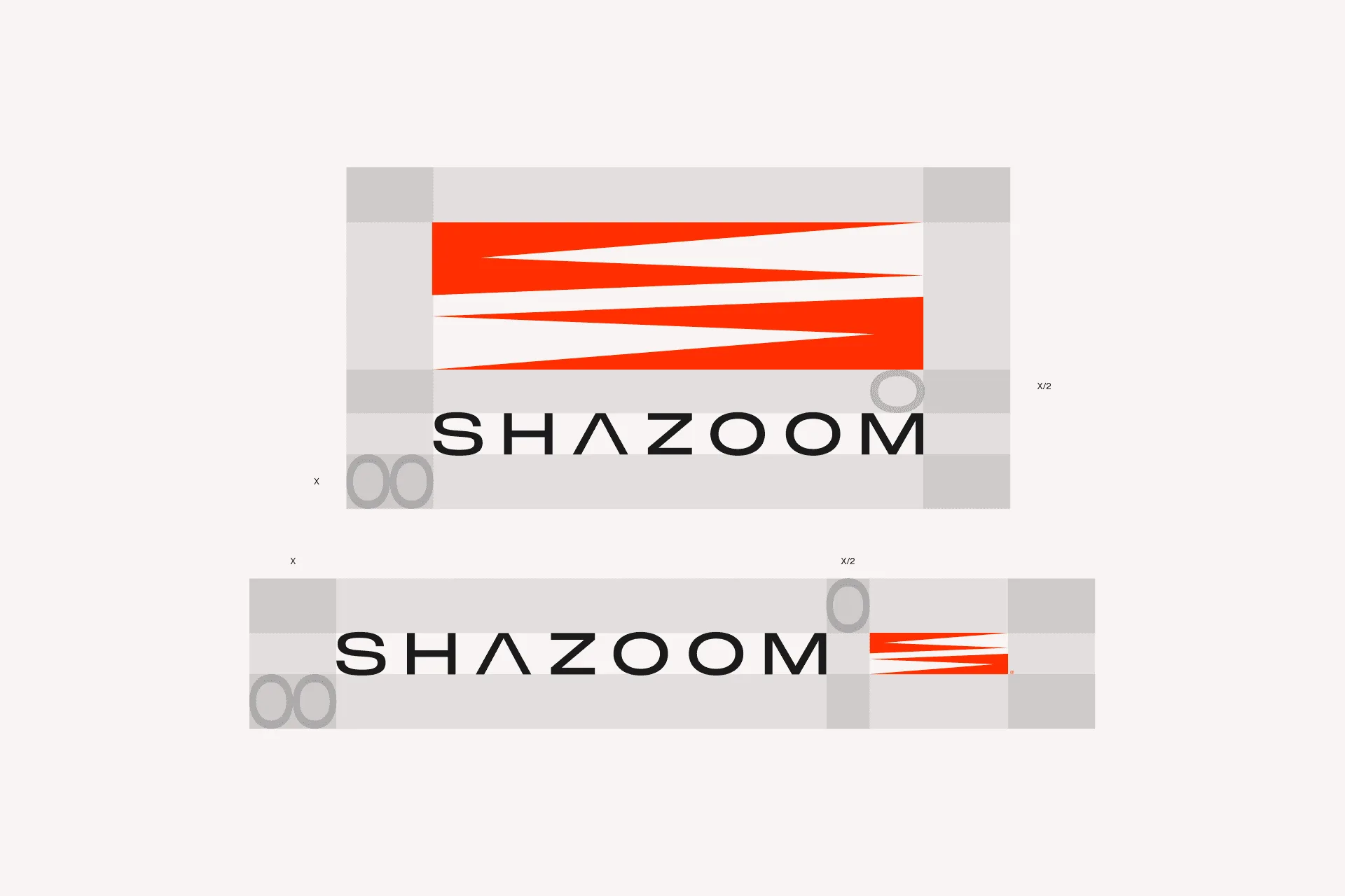
Shazoom Red, sand and matte grey, with clear space measured in X.
In use
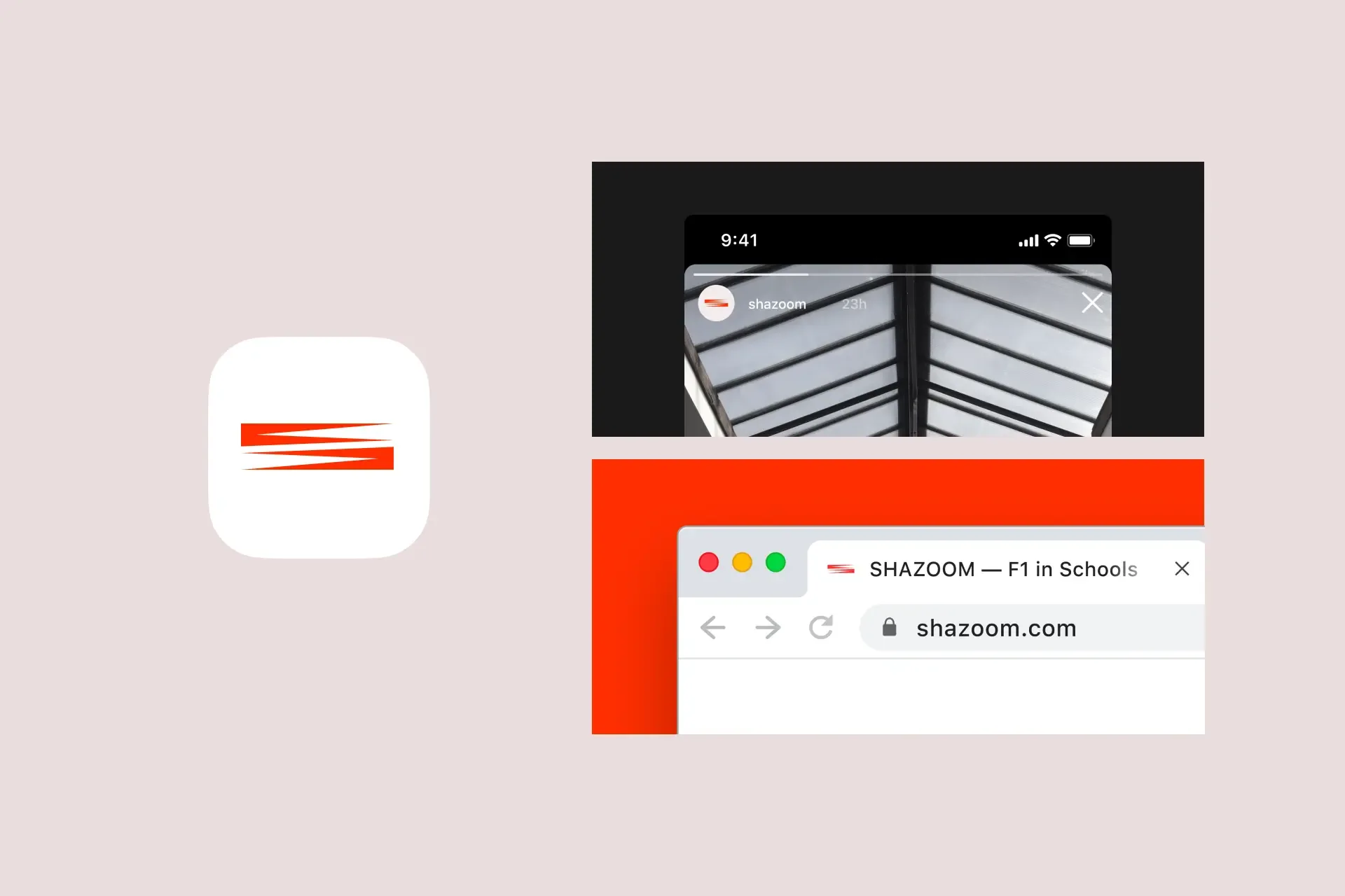
From the team principal's card to the app icon.

Connections
- Shazoom stacked and horizontal lockups
- Shazoom mark over F1 car

- Shazoom lockups
- Shazoom on red